Utility Views
Why this app?
While developing the Remote Control Flight Log app I realised that I was re-creating many of the views I had used in other apps and was creating some new views that would, undoubtedly, be useful in future apps. It seemed crazy to copy and paste these views around so, based on what I would have done in my Windows days, I looked to create a framework to put them in and share them.
Creating a framework didn't look all that complex, but the documentation is a little sparse and often contradictory. I was also a little uncomfortable with the idea of distributing the source code and re-compiling it in the projects that use the framework. Somehow it doesn't feel much different to copy/paste of the code (yes, I know it is very different).
After much digging around, I came across Apple's xcframework concept that allows me to build my framework as a binary. This seemed ideal (though it has it's own drawbacks). So, UtilityViews was built and a single shared view was created.
Scarily, it worked.
I have expanded the framework to include a number of pretty simple views and a couple of quite complex ones. I also took this opportunity to have a play with documenting my framework. So all the classes and public interfaces are commented to the Apple docc standard. Sadly, at the time of writing, a bug in XCode is stopping that documentation being displayed in any consuming projects.
Key Learning Points
What did I want to achieve?
This project required a lot of learning. A framework isn't like ordinary code and requires coding in a different style. Not least of which is making everything public and being forced to code initialisers for classes. The number of times my code has failed because I missed one of these is frightening. However, the key points I took away were:
- Creating an xcframework.
- Building the framework from the command line using a shell script.
- Creating docc documentation.
- Isolating functionality to a single form
I'm left with one issue. Having created the docc documentation, I'm at a loss as to how to integrate it into the xcframework and make it available to the consumer of the framework. I can build it and use it in the test app, but it fails to appear in any client app. After a lot of googling I am no closer to a solution. Apparently, this all works with an Objective-C framework, but not a Swift framework. Others have confirmed this issue, so I'm confident that I'm not doing anything wrong.
What is in it
And the end result is...
And this is what I ended up with. There are many sharable views and it does not seem sensible to document everything here in great detail. So, here's an overview of what we have.
KeyValueView
KeyValueView lets you display a key/value pair where the key can be either a string or an image. The key is displayed on the leading side and the value on the trailing.

CheckBoxView
CheckBoxView is used when you want to show a text (key) value along with a boolean value to show state.

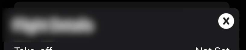
DateTimePickerButton
The DateTimePickerButton is used in conjunction with the DateTimePopup to present a 'button' that the user can tap to display a popup date/time selector. The button handles the date not being set (nil) by displaying 'Not set'.

DateTimePopup
Used in conjunction with the DateTimePickerButton the DateTimePopup presents a modal view to the user to select a date/time value. The code also handles there being no starting date and sets limits on what dates can be selected.
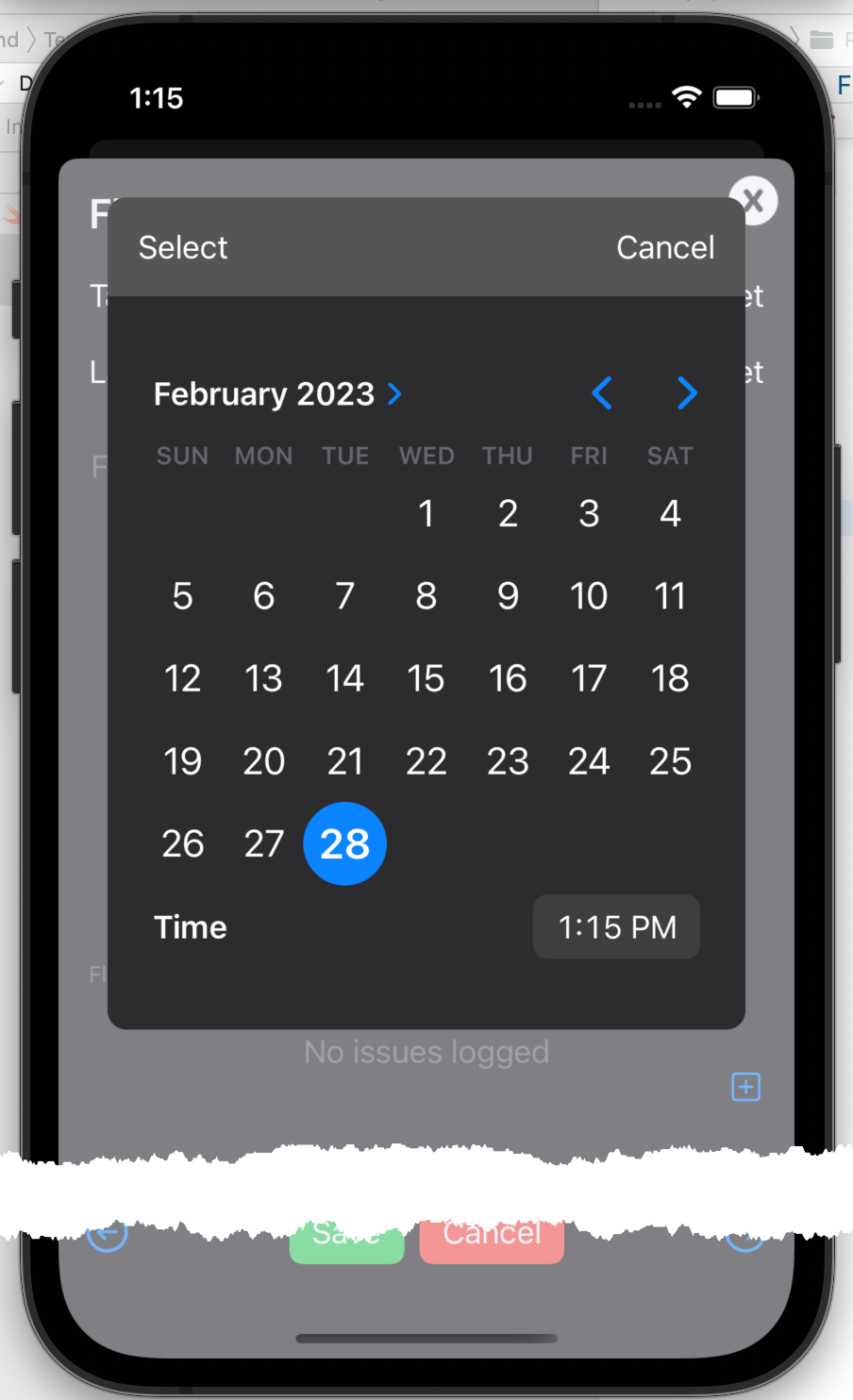
The caller can optionally display the time picker and can optionally display a clear button to clear the selected date/time. The key feature of this picker over the standard supplied picker is that it copes with optional dates. This is essential in order to support the clear button as this is handled by passing a nil value for the selected date.
XDismissButton
XDsmissButton provides a consistently styled image to be used in conjunction with an overlay to close a popup modal.
TextEdit
The TextEdit component provides a text input component that accepts multiple lines of text with the advantage of having place holder text. The standard multi-line text input component does not support place holders.
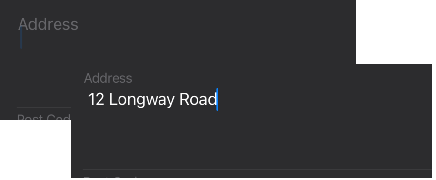
FloatingTextView
FloatingTextView is a variation on the standard TextInput input component that keeps the placeholder text visible on screen as the user types their input.
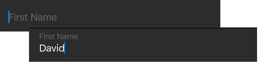
When the user starts typing into your text field, the placeholder is made smaller and moved above the input text. It's debatable whether this is 'good practice' but I believe it helps the user by ensuring that they always know the purpose of the data they are entering. That can be difficult if there are several text fields on the form.
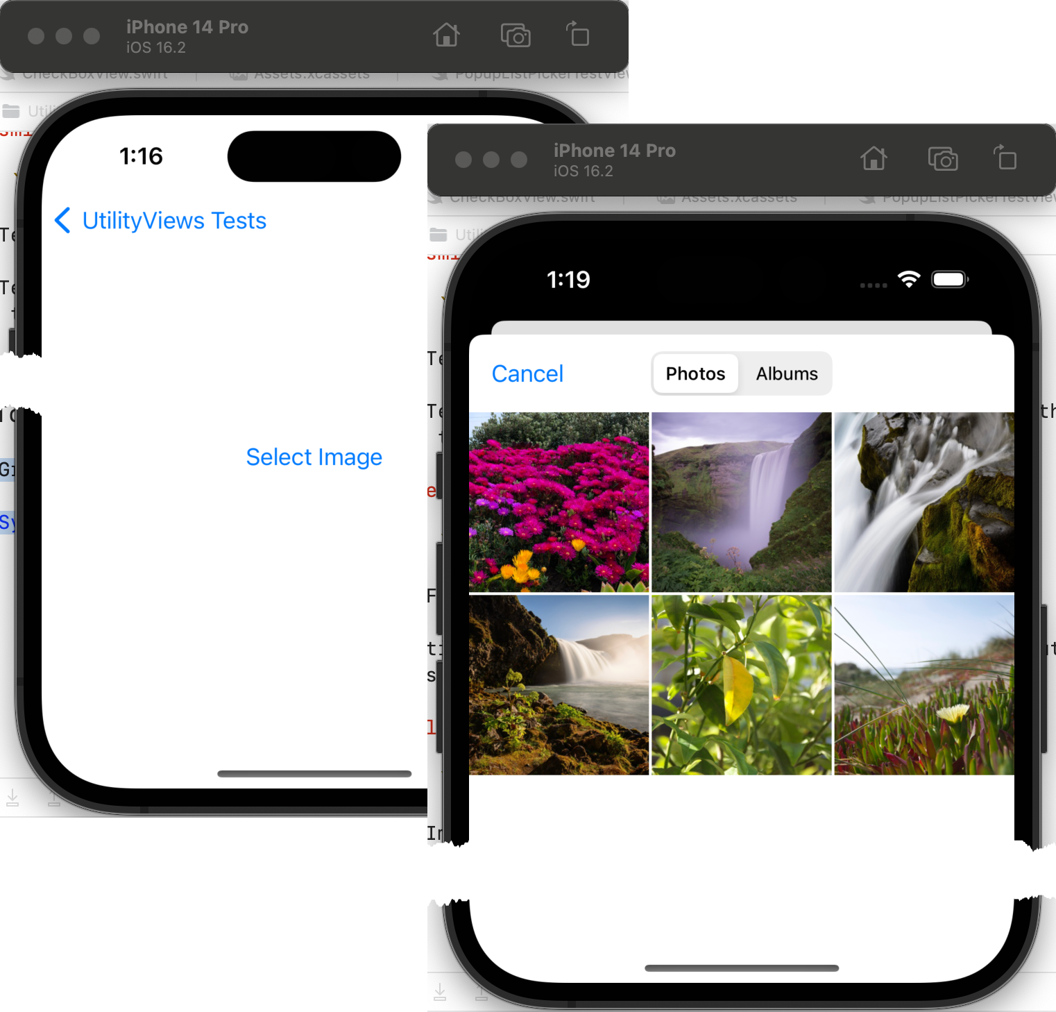
Image Picker
The image picker allows the user to select an image from their photos library or to take a picture with the camera.
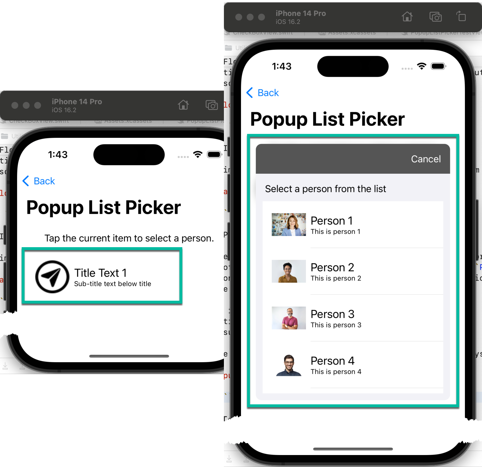
Popup List Picker
There are times when you want to be able to display a more complex picker than is available in the standard set of components. This component is a combination of PickerPopupButton for displaying a complex button and PickerPopup for displaying a list of options to pick from. Each option will consist of three items;
- An image.
- Title text.
- Sub-title text.
These are reflected in the button, so the user can always see what the current selection is.
Updates
And so it grows
Being a framework library, it's purpose, besides sharing code, is to grow. As I need more components that can (and should) be shared, they will be added to the framework.
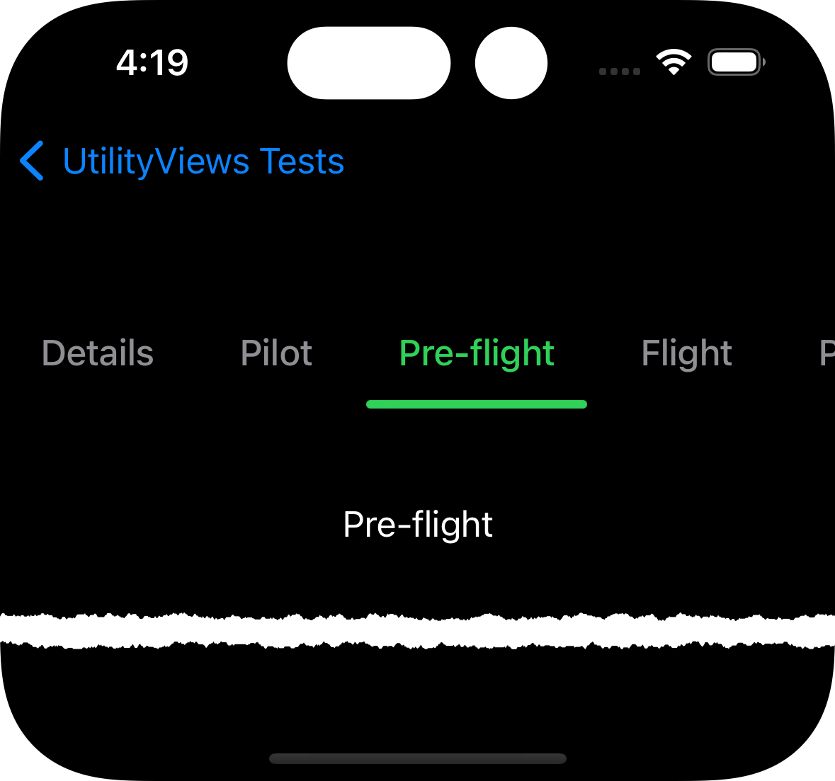
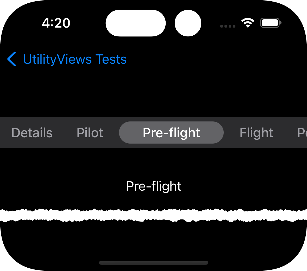
SegmentedView (In version 1.1)
I started out with a multi-page input form which I wrapped in a ScrollView to the user could scroll between pages. It worked Ok, but was less than intuitive. I needed a better way to indicate to the user that there were multiple pages and to give them a more intuitive way to access them. The SegmentedView was the result.
It comes in two variants. The first uses text with an underline to indicate the current item. When a new item is selected, the underline scrolls to the selected item giving the user some animation feedback.
The second is a more traditional pill style. When an item is selected it is highlighted with a background pill shape and the surrounding items are moved slight further away. This gives the user a minimal and subtle indication that the selection has changed.
PDFViewer (In version 1.2)
As part of my development of the Version 2 of the flight log I decided to add reporting. Best I can tell, there is no reporting component for Swift apps, so I am faced with writing my own. When I can organise my thoughts, it's going to have to be a PDF file generator.
With that decision comes a pre-requisite need; to be able to display any PDF file I create. That's where this component comes in. It's a very simple PDF file viewer with the added bonus of being able to share the file by saving to files, sending to the printer or applying markup and saving the modified file.
Source code
No secrets here
If anyone wants to take a look at the code, it's up on GitHub in my Utility Views repo.
Testimonials
Am I really any good?
Don't take my word for my abilities, take a look at other peoples opinions about me.

One very quickly runs out of superlatives with Steve. He is the cleverest person I know. He is highly innovative, passionate regarding the proper maintenance of agreed standards and protocols and establishes excellent relationships with our clients.

Steve is a rare developer resource who is able to provide a good breakdown of technical solutions for all audiences to understand... Steve understands the importance of project deliverable's both from a client and business perspective and shows a personal pride in ensuring the delivery schedules are met.

I have worked closely with Steve for his time with us and long before we formed our company. His technical ability far out-performs anyone I have known or met in companies we have worked with like IBM/EDS/Cap Gemini

Steven showed a great deal of commitment and skill when he worked with me. His attention to detail, comprehensive documentation and well thought out code, using very impressive technical standards meant that it was always possible to rely on the solutions provided being top notch. Steven is an asset to any company, at any level - if I were able to, I'd love to work with him again.

I have had the pleasure of working with Steven for several years in my role as CTO. He his one to the most multi-disciplined technically skilled developers I have known but what sets him apart is his eye for, and attention to detail, particularly when considering the user experience. I would absolutely not hesitate in recommending Steven.